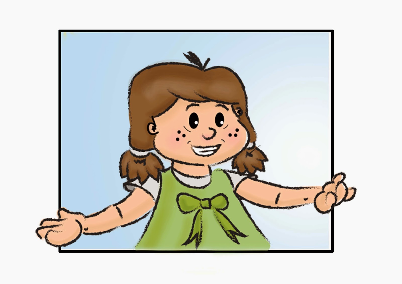
Here are the developed character designs of the two main characters, Charlie and Pippa Button, In these images i am determining what colour pallet works better between the characters costumes and they're hair/skin colour to obtain the best design out of each character. I think its best to keep continuity running throughout the actual character designs which is why i have kept some features the same such as eye chap and nose shape in order to reinforce that the characters are related and have certain similarities, this will be my intention throughout the development of the other characters also.
Tuesday, 18 March 2014
Initial character design work
Here are my INITIAL design sketches, the first three are sketches that i had to get down when i was thinking up my storyline, then I have began to come up with a few sketches in order to make different variations of potential characters. The designs vary in size, shape, hair type, eye type, nose type etc.. It offers up potential characters that i could take into the development stage and maybe change different features to make the perfect ideal of that character to make an interesting character for the purpose i need it for. These are designs for my initial five characters that i will defiantly be needing immediately for this series, there will probably be minor characters added as the story line progresses.
Pre production- Concept sketches
This project is for initially a one off series to be televised, Aiming at a target demographic of 3-10 year old children, both male and female intentions. The story line is designed to be an educational programme that not only educates children with shapes colours, emotions, but aids compassion, problem solving, right and wrongs and general life values and expectations. The plot of this is a simple one, one that can be elaborated in many different ways:
An overview of the plot,
This series shows the main character Charlie Button and his big sister Pippa's fury, frustration and disappointment when they leave a big city to move to the suburbs with they're parents. Charlie holds a wild imagination and a strong will for adventure, but always gets carried away in his make believe lands, to the dismay of his big sister. Whilst moving to a secluded, odd looking house, charlie stumbles upon something in a box left in the attic.. a cloak, and a wand.. this is where Charlies dreams come true, he has power, power to do anything he wishes.. literally. will his wishes cause him more harm than good as he isn't the rightful owner of these possessions. Will char lies journey become real or will it be purely his imagination.
Initial Business Card:
Here is my business card design, I think it is successful, i think it features a nice piece of work but also it keeps some subtlety and a nice neutral colour palette. I believe that it is striking and eye catching, I have actually had 250 of these printed out and one negative i would give about them would be that when I produced them digitally they looked like the ones above. however, what i should have considered is that when they are reduced to the appropriate size the text becomes very small, something that i have to now change because obviously the text should be the most important information and should be very in your face. My design needs were to keep everything very traditional and classical, so i have used subtle text, but the font size just needs to be increased to make it 100% effective.
'Momma come home' illustrative book concept
Here is the concept for the finished product, The product is a illustrative story book for a child that suffers with learning difficulties, During the project I was liaising with a girl who suffers from many different types of learning difficulties, that has aided my knowledge an understanding of the design process of the way children with particular difficulties, process information and how visual aid can benefit a lot with interoperation of text. The design structure embraces the research i have conducted in order to formulate something that can aid children's learning and development. As you can see there is limited detail, and colour to be easy on the eye which coincides to the reason in which the illustrations are on cream not white because that also is a big factor that prohibits people with learning difficulties development.
Colour schemes
So my primary intention here, is to highlight the colour schemes and place them together to see if they work. However, that isn't particularly important with this particular body of work. This body of work is designed to be used by children with learning difficulties, such as, dyslexia or dyspraxia. for the purpose of the project i have chosen particular colour schemes in the design process but they aren't essential with the finished product, due to the product having the intention of using dyslexic colour overlays over the images. This dulls the colour schemes quite dramatically to be easily readable for the child.
Working story board
Here are my working storyboard of the scene, featuring the style and colour schemes. This demonstrates, the illustrations, and dialogue of the page, the page numbers and the action of the shots. However, i am yet to determine how the images and text will be formatted on the page and how to take the best approach to see the images and text clearly and be able to recognise that they are linked.
Subscribe to:
Posts (Atom)


